Making Bulk Gift Cards Simple, Transparent, and Trustworthy for Businesses.
Overview
GiftCardGranny helps businesses purchase bulk gift cards for employees, clients, and promotions. The site offers businesses gift cards for corporate rewards and incentives; however, business users experienced friction in understanding the product offerings, associated costs, and order workflows. Conversion rates have cooled off, and we’re seeing a downturn; support inquiries have returned to high levels, and mobile experiences were suboptimal.
Goal: Redesign this business gift card experience by increasing clarity, reducing friction, improving trust, and ultimately increasing business account requests and larger order conversions.
As Gift Card Granny expands its services, it faces common scaling issues. The business section struggled to support decision-makers seeking bulk gift cards. Users often experience frustrations, such as difficulty finding information, repeated errors, unclear calls to action, and a complex checkout process, which hinder purchases. Design and usability gaps, including outdated visuals and mixed messaging, hurt trust, especially among business buyers needing clear justification and seamless fulfillment. The goal was to modernize the experience and rebuild confidence, reaffirming Gift Card Granny’s reputation as a reliable partner for business incentives.
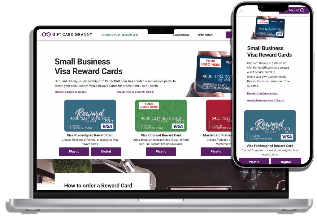
Business users could not easily distinguish between digital and physical card offerings.
Pricing, minimum order quantities, and delivery timelines were not immediately clear.
Long or complex builds and form inquiries caused high drop-off rates.
Support inquiries were frequent due to confusion about errors, card balance issues, and order processes.
Mobile UX was inconsistent, and CTAs were not prominent enough.
Objectives
The objective was to reimagine the Gift Card Granny for Business experience, driving higher engagement and trust while reducing barriers to purchase. Specifically, the redesign aimed to increase conversion rates, reduce cart abandonment, and strengthen brand credibility among business buyers. Achieving this required simplifying the purchase journey through clearer navigation and calls-to-action, modernizing design elements to match user expectations, and providing transparent information on pricing, fulfillment, and support. All this cannot be accomplished without the focal point being the point of entry and how we’re handling exploration and feedback.
Provide clarity and transparency around ordering, pricing, and order processing.
Establish trust and credibility with enterprise buyers.
Create a guided, step-by-step flow that reduces friction.
Improve efficiency for repeat users with streamlined tools.
Align the design with Nielsen’s 10 Usability Heuristics to ensure a user-centered experience.
Step One: Discover
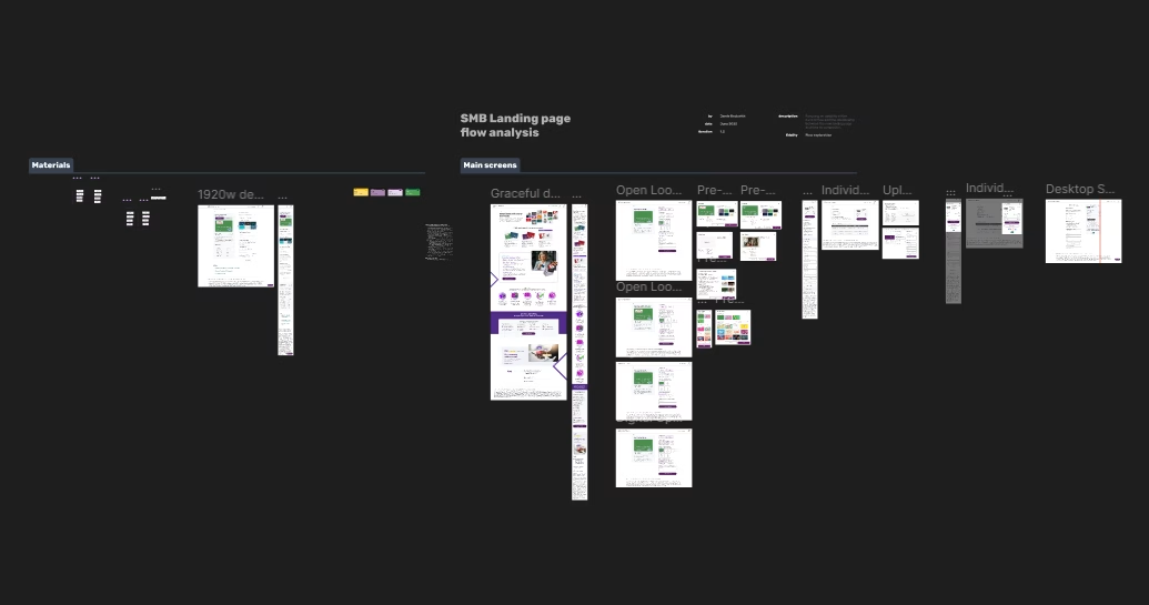
Strategy and process
Heuristic Evaluation: Conducted a review using usability heuristics, identifying gaps in visibility, consistency, and error prevention.
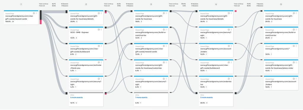
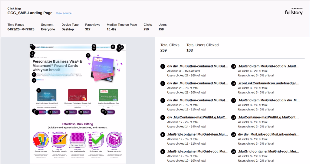
Behavioral Observation: Full Story was instrumental in determining the users’ exploration and interaction patterns. This allowed me to adjust the designs by seeing the heat and journey mapping.
User Sentiment: Utilizing Zendesk, we set out to review where the gaps are in the communication of the products offered, and how users are perceiving the build process.
Behavioral Observations
User Heatmapping
Step Two: Define
Redesign approach
Clarify CTAs: Consolidated vague prompts into a consistent, specific call to action (“Request a business account”), and decrease internal language (Plastic or Digital).
Visualize the Process: Reduce and introduce a clear 5-step order journey.
Trust Building: Integrated business case studies, testimonials, client logos, and security assurances.
Content Simplification: Reduced redundant sections and introduced accordion FAQs.
Flexibility Enhancements: Proposed business accounts with saved preferences and quick reorder features.
Figma workspace
Step Three: Design & Iterate
Deliverable
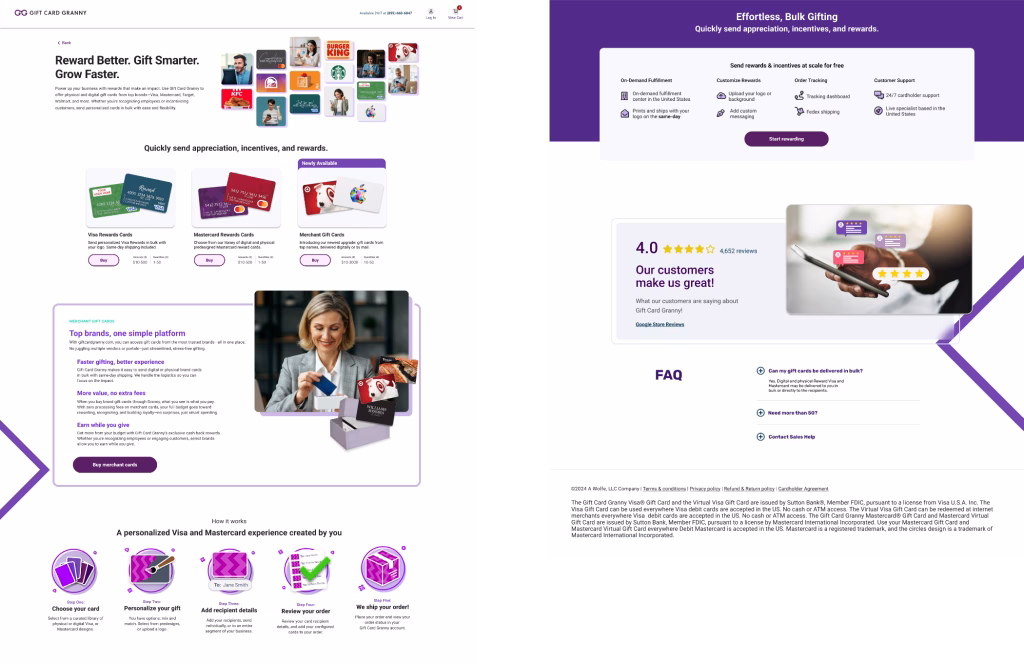
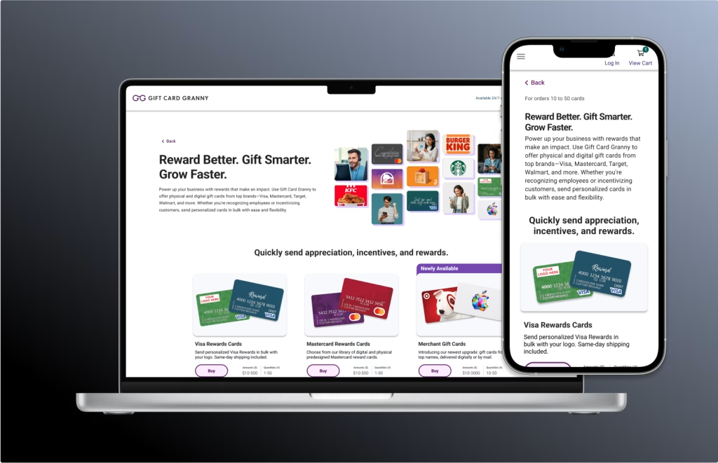
High-fidelity UI mockups for desktop and mobile.
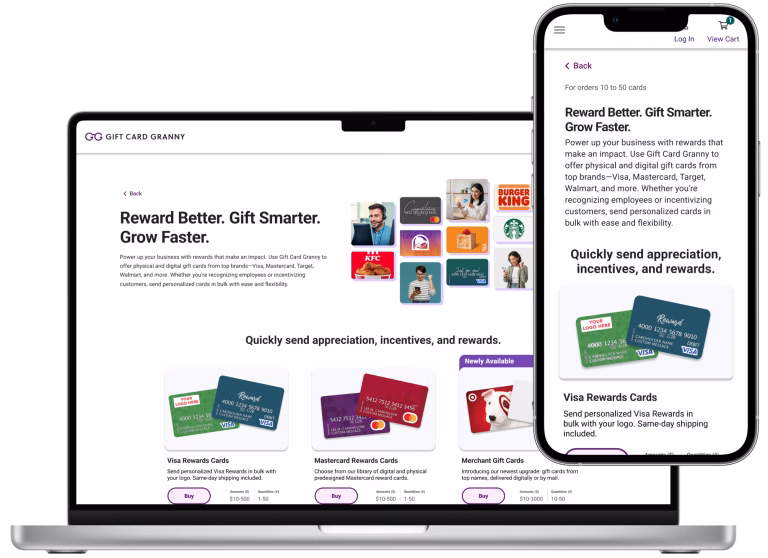
Hero section redesign with a bold value proposition and single CTA for quick builds.
Step-by-step process flow visualization.
Trust section featuring testimonials, logos, and security badges.
Mobile-first responsive layout with sticky footer CTA.
Deliverable (Future)
Redesigned “Business Gift Cards” page with clear product summaries, pricing info, and CTA placement.
Streamline quote/order form with conditional logic and inline validation.
Provide pricing transparency by adding an interactive calculator and a tiered pricing table.
Update help documentation and business-specific FAQ section.
Redefine analytics tracking plan in GA4 for conversion, Full Story scroll, and form completion metrics.
Step Four: Deliver & Launch
Outcomes and impact
6% increase in conversion rates through simplified CTAs and transparent pricing.
Faster decision-making for business buyers with clear process visualization and a quick ship order flow was introduced.
Stronger credibility with added trust elements.
Stabilized abandonment by lowering cognitive load and clarifying next steps.
Key takeaways
When we examined the user experience, one theme repeatedly emerged: clarity must come first. Business users don’t want to guess—they still need pricing, timelines, and product details upfront to make informed decisions.
From there, we learned that trust directly influences conversions. Preventing errors, creating clear messaging, and providing visible support options gave users the reassurance they needed to proceed.
But these insights didn’t come overnight. Through iterative testing with heatmaps and GA4, we identified friction points that weren’t obvious at first glance. Data helped us refine flows, messaging, and layouts.
One of the most significant improvements was simplifying journeys. Using progressive disclosure and inline validation reduced cognitive load and made complex tasks easier.
Finally, we couldn’t overlook the importance of mobile engagement. After optimizing layouts and enhancing calls-to-action on small screens, we saw a substantial increase in interaction and completion rates.